This post is, like this one, is written with two particular students in mind.
MS here stands for Mass Spectrometry.
I'll be presuming that you have exported your data as a csv file as shown in http://verahill.blogspot.com.au/2013/07/474-exporting-data-from-wsearch32-and.html
Our scenario:
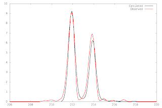
So you've exported your data as e.g. data.csv, and you have assigned a signal in your spectrum to a species, and you'd now like to plot the predicted and observed isotopic envelopes in a way that will help you compare them.
The signal we have identified is at 211.90 m/z and we think it belongs to [Ga(CH3OH)2(OH)(NO3)]+.
The Linux way:
You'll need: sed, gawk, gnuplot, pyisocalc or Matt Monroe's Molecular Weight calculator
1. Generating the isotopic envelope:
A. Using pyisocalc:
Set the charge to 1 and output the data to 1.dat, with a gaussian broadening factor of 0.3:
isocalc -f 'Ga(CH3OH)2(OH)(NO3)' -c 1 -o 1.dat -g 0.3
B. Using Matt Monroe's molecular weight calculator
Go to Tools/Isotopic Distribution Modelling
In the spectrum window, go to Edit, Copy Data Points, and paste into e.g. a Gedit window. Save as 1.dat
2. Formatting the data.csv for gnuplot (can skip for spreadsheet programs):
In a single line we remove the first eight lines, replace all commans (,) with tabs, only keep the m/z and relative isotopic abundance columns (2 an 4) and save the output to data.dat
tail -n +8 data.csv |sed 's/\,/\t/g'|gawk '{print $2,$4}' > data.dat
3. Plotting:
A. Using gnuplot:
Create a file called 1.gplt which contains the gnuplot commands:
($1-0.05) means we're offsetting the calculated data by 0.05 m/z. ($2*0.092) means that we're scaling the calculated data intensity to match that of the observed. lc sets line colour and lw sets the widthset term postscript eps enhanced color set output '1.eps' set xrange [206:220] plot '1.dat' u ($1-0.05):($2*0.092) w lines ti 'Calculated' lc -1 lw 2,\ 'data.dat' u 1:2 w lines ti 'Observed' lc 1 lw 2
If you want the output as png instead of eps, just change the first two lines to
set term png size 1000,667
set output '1.png'
 |
| Using pyisocalc |
 |
| Using Matthew Monroe's calculator |
Qtiplot is in the debian repos and is 'origin'-like (as in Microcal Origin).
You'll need to rescaled your calculated data first, which is a major drawback:
cat 1.dat|gawk '{print $1-0.05,$2*0.095}'> 1_scaled.dat
Start QtiPlot and select Open. Make sure you select 'all files' as the file type. Open 1_scaled.dat.
Next, make sure that the spreadsheet is active, and go to File, Import, Import Ascii
Change the type of column 3
Select all columns and go to Plot, Line. Change the axes (double click on the axes and set the new ranges), set the top and right axes no to show, edit the titles etc.
The Windows way:
You'll probably need: excel or open/libreoffice, origin, pyisocalc or Matt Monroe's Molecular Weight calculator
Doing this on windows is a PITA compared to Linux, and I don't have the time to go through it. If you do have Origin, it should be straightforward to translate the instructions above into an MS Win-like environment.
Any scaling will have to be done in Excel or a similar spreadsheet program. Not difficult, but it'll add a few extra steps.


No comments:
Post a Comment